Cover art, movie theaters, lazy writing, clunky first chapters, and being incredibly successful
Hello all! It's been a while since I last posted, so this is a round-up of what's been happening over the past month or so.
My latest book, Gargoyle Scourge (Island of Fog Legacies #3), has been on sale for two months and is doing well. I'm happy to say reviews have been favorable. And now I'm working on Book 4, Haunted Fortress. I've written over half of it already. This time, just for a change, I wrote a detailed chapter summary and got started with the middle section first. Why? Because it's a fairly complex plot, and it actually made sense to write this book out of order. After completing the middle section, I then filled in most of the opening chapters and am now working on the last third. It's working out nicely.
Haunted Fortress features Travis and Melinda with alternating points of view (chapter by chapter), and it's refreshing to write like this. When they share scenes, I just switch POV and carry on. But they can also go off on their own personal missions, and that's where the alternating POVs really shine.
As usual, this novel will be a complete standalone story as well as being part of the overall series arc.
It's worth noting something about the cover. I've said before that, being a poor nobody-author, I can't afford to hire my own cover artist to paint something that matches the details of the story... so I often write to suit the artwork rather than the other way around. In this case, it had been a while since I looked at the cover, but I went ahead anyway and described the fortress as Travis and Melinda arrived. Big mistake! I finally opened up the artwork and realized I was quite a way off with my description, so I had to adjust my wording. In fact, I ended up adjusting some of the rooms I'd written about as well. I doubt whoever created the original artwork ever guessed he or she would be instrumental in shaping my story.
And with that in mind...
Putting My Book Covers Together
It might be interesting to see all four covers in this series so far alongside the original artwork I purchased:
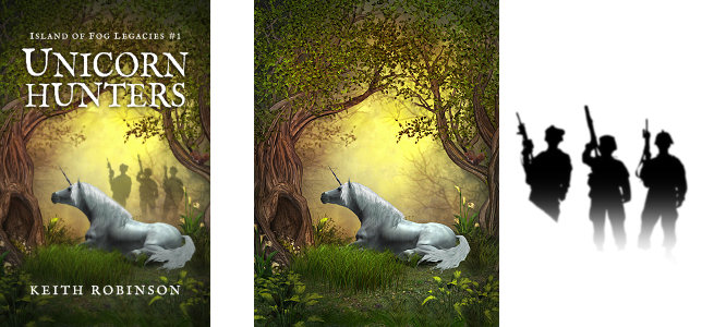
With Unicorn Hunters, I found a nice unicorn-in-a-forest painting and cropped it to the right shape. Then I added a silhouette of some hunters and faded it out so they look like they're standing in a mist. (I cheated a bit, and the bushes behind the men actually show through, which is wrong -- but it's not very noticeable, and I could argue the bushes are in front of them, not behind.)

Sinister Roots was easy. The artwork was just what I wanted, and I altered the color mainly to set it apart from anyone else who might be using this stock image. Obviously I had to resize and crop slightly.
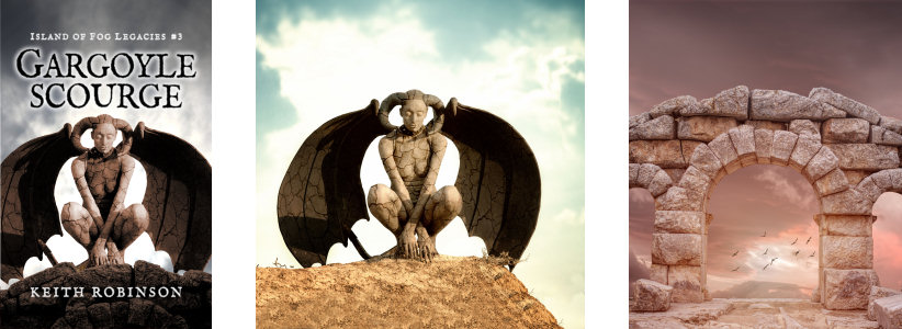
Gargoyle Scourge was quite difficult because I had to cut out the gargoyle figure and separate her from the background so I could sit her on something more relevant to the story -- like a stone archway, which I also had to remove from its background. Lastly, I added a brand new sky. You may wonder why I removed a sky and then added one back in that's very similar. Well, it's pretty common for stock images to have very little space above the subject for book titles. Look at the next one...
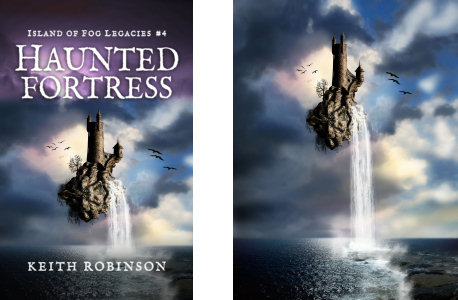
Haunted Fortress was pretty easy except for the lack of space for the titles at the top. Also, the fortress was floating so high that I would have had a lot of dead space below. What I really wanted was to just slide the fortress down so it sat nearer the sea, but that's not quite feasible. So I added some sky above. As it happens, I found a sky that was pretty close in "cloud-texture," and I just had to alter the coloring so it blended in. It's hard to tell the difference. Then I cut out a section below the fortress and above the sea and blended the join. This new version meant I could zoom in a bit and show the fortress in more detail.
With all book covers, I darkened the area around the top corners. This makes the white text stand out more (even with Gargoyle Scourge's dark text and white glow). I usually end up darkening the bottom as well for the same reason.
The covers shown here are the printed versions, which are sightly taller than the ebook versions because I have to allow a bit extra for trimming. With the ebook versions, I just crop a bit off the top and bottom.
So there you go, a quick look at my methods! Now, changing the subject...
A Trip To The Movie Theater
We went to see Beauty and the Beast recently in a new-ish theater that has massive reclining leather chairs and ample room. I'd stopped going to movie theaters a few months ago because of the poor picture quality; we'd watched Rogue One and enjoyed the movie, but the picture was dark and drab, needing more contrast, brightness, and color. Horrible! This wasn't the first time I'd experienced this, and this was the last straw. About $35 for a family of three including popcorn, and we can't even see what's happening in the nighttime scenes? Nope.
But this new theater is brilliant. Plenty of space, excellent picture quality, and only a dollar more than normal theaters. We'll go again -- but only to MUST-SEE movies. Beauty and the Beast was something my wife had been looking forward to, and I enjoyed it as much as she did. Although... Hermione Granger didn't do any magic, and Ron Weasley was nowhere to be seen. Unless Ron was the Beast? I'm not sure. And what was all the singing about? Who breaks into song in the middle of a conversation? Oh wait, my wife does...
Anyway, as usual with family movies like Beauty and the Beast, I found myself hanging onto the dialog and analyzing how screenwriters reveal everything the audience needs to know so deftly in the opening scenes...
How Writers Get You Up To Speed -- Deftly Or Otherwise!
Some movies are terrible at this. This brings to mind the lazy writing of certain TV shows where the main character might look toward the camera, narrow his eyes, and say, "Looks like we need to pay a visit to someone I know..." before putting his sunglasses on and stalking away. And then, the very next scene is this character and his sidekick getting out of a car having traveled for five hours across the state. They're sweaty and tired, and the sidekick is irritable as he asks, "So who's this person we're visiting, anyway?" whereupon the main guy explains everything as he rings the doorbell. Works a treat for the TV audience, right? Gets the information across most expediently! Yet it's utterly ridiculous to imagine driving all that way without discussing where they're going. Maybe the sidekick actually did ask at some point. The reply was, "Can't tell you yet. Wait until we're there on the doorstep when the TV audience is listening. Then I'll explain all."
So I always find it interesting how movies (and TV shows, and also novels) introduce their audience to the world, characters, and current situation. The dialog has to be JUST informative enough to get the audience up to speed without being stuffed full of nonsense real people would never say. Nonsense like: "Say, it's nice of you to look after my ten-year-old boy Simon and my eleven-year-old girl Suzie while I visit my sick sister for three days. Although your house is out in the wilderness with no phone signal, I'm sure the legends of the witch around these parts won't make them feel uneasy. They're just stories, right?"
There's definitely an art to getting it just right. I think your average TV cop show is lazy about this kind of thing. Another thing that's lazy is a novel that dumps a ton of exposition on the reader on page one -- like explaining that the land was once vibrant and full of magic until one day a thousand years ago when an evil warlord rose up and cursed everything, and since then... blah blah blah. Who wants to be told everything secondhand all in one go before you even know the characters and story?
To be fair, I've done this myself to some extent -- I think all authors do it until they wise up -- but it still amazes me how many traditionally published famous authors do it. I gather that fantasy fans are more forgiving. They buy a book, get comfortable, and lap up every detail of this grand new world they're entering. But there are better ways to introduce a new world. Have the character live in it for a while first, and sprinkle explanations as you go along. I think the trick is to weave your story so it's got something interesting going on from the very beginning at the same time as showing the reader around the place. The character has to come first, though. Make a reader care about the character and then talk about where he lives. Don't tell the reader where someone lives and then introduce that someone afterwards.
First Chapters Always Feel Stiff
I think this is especially true of all first-time authors. You try so hard to be poetic and everything, and you're still finding your way around the mechanics of dialog and narrative and so on, and the first one or two chapters are bound to feel stiff and forced. After a while, you get the hang of this writing lark and settle down with smoother, more professional prose. But your first chapter still stinks.
So what's the answer? Simple. Write your first chapter last. It makes sense when you think about it. It's the single most important chapter because it has to hook the reader and get them to read the rest of the book. So treat them to your most professional writing skills and not your clunky early efforts.
I suffered from this problem with an early version of Island of Fog. However, the finished product is not that book. I wrote the first eight chapters, then rewrote them, then ditched the first four chapters, and so on... meaning that my current first chapter is actually a zillionth rewrite. So in that sense, I smoothed out my first chapter simply by ditching it.
And finally for now...
Being Successful Enough To Easily Raise Money For A Good Cause
I'm subscribed to a British author named Mark Dawson. Recently, he sent out an email that made me all wistful. In a nutshell, he took a month off from his ongoing project to write a novella where the proceeds would go to a good cause (in this case a friend of his who needs £40,000 for a new trial drug to combat cancer). With $2.00 from every sale going to this fund, and with 80,000 subscribers on his list, it means that if even half his readership buys a copy, the treatment will be funded for a year and a half.
I would imagine he'll get close to that goal. Imagine having such power at your fingertips! To write a book, put it out there, and generate potentially life-saving funds for a friend. It's all in the numbers, though. You need that fanbase, and 80,000 subscribers would certainly get things done.
Meanwhile, I'll push on with my significantly smaller but equally cherished subscriber list and hope to keep growing my fanbase for years to come.
Thank you, all!
Thanks for the cover mini-tutorial. I've always liked your covers and it's nice to get a peek behind the curtain to see how you create them. And yes, first chapters do always feel stiff. Still working on that problem.
Ha! Love the chapter by chapter alternating POV.
Interesting to hear how you make book covers as a self-publisher. I'm curious, where do you purchase your images, and what software do you use to make the covers?
Gil, I buy my images from 123rf.com (about the cheapest I can find, and a good selection). I use Paint Shop Pro for all my graphics work.
Show/hide all posts
- Box of Fables (Island of Fog Book 16) is finished! How would you like to read it earlier than everyone else?
- How to find the best keywords for Amazon (AMS) sponsored ads
- Next Chapter Con - A Books and Authors Convention
- The best laid plans of mice and men... and overworked writers who bite off more than they can chew
- Look out for at least 3 new books coming in 2019
- Book cover, title, and blurb - how did I get it so wrong?
- A cat named Frosty, a new book convention, and unicorns
- Fantasy and sci-fi cons and other author events
- Sci-fi episodic serial fiction - free for KU Kindle Unlimited readers
- How I'm going to publish 15 books in seven months
- Post a review for Island of Fog Box Set 1-3 and help make the next Box Set free!
- Doctor Who, anyone?
- Death Storm (Island of Fog Legacies #5) is published!
- A mild obsession with talking dragons in my fantasy books
- Middle-grade fantasy books with an Island of Fog theme
- Finding mythical monsters to put in my books
- Working hard to hardly work
- Island of Fog Box Sets now available... and FREE on Kindle Unlimited
- Get ready for a World of Fog
- Exactly how many times does an author edit and proofread a novel before publishing?
- New book hurtles toward publication
- Female fauns and other imponderables
- Save 20% on Island of Fog titles for a limited time
- A faun with a mist-erious power
- Think your book doesn't need proofreading? Think again!
- Results of BookBub promo for Sleep Writer (Book 1)
- Warp Giants (Sleep Writer Book 4) is published!
- A book is finished, and a new one starts!
- Con Nooga... and reactions to my book selling techniques
- Goodbye 2017, Hello 2018
- Tails of a Shapeshifter is published!
- Sleep Writer series has a brand new set of covers
- Constructing, websiting, and writing all at once
- Haunted Fortress (Island of Fog Legacies #4) is published!
- Completed book, forthcoming books, audiobooks, book sales, book covers, and... darkness!
- Book 4 of the Island of Fog Legacies just about finished
- Cover art, movie theaters, lazy writing, clunky first chapters, and being incredibly successful
- Novel proofreading service
- Gargoyle Scourge (Island of Fog Legacies #3) is published!
- Gargoyle Scourge available from bookstores on March 1st, 2017
- Island of Fog translated into Spanish!
- Gargoyle Scourge is ready for beta reading
- Happy holidays, massive downloads, foggy plans, black comedies, and daft ideas
- Gargoyles, a classroom in Australia, book reviews, and my kitchen floor
- Working on a new book cover for Sleep Writer
- When is it okay to give away major plot details?
- Latest book, website changes, marketing, and freebies!
- What's a self-published indie novel really worth?
- Sinister Roots (Island of Fog Legacies #2) is published!
- Sinister Roots launches in 9 days... and Unicorn Hunters is on sale!
- Plotting the next book
- Sinister Roots is finished!
- Back from vacation, and hardly a word written!
- Writer's block, stalling, and just plain old procrastination
- How do most readers find good new books to read?
- On the lookout for repeated words in manuscripts
- Free short story The Silver Wand (Part 4 of 4) now available
- Introducing the next book in the Island of Fog Legacies series
- Answers to a few niggles
- Unicorn Hunters (Island of Fog Legacies #1) is published and available everywhere!
- Free short story The Silver Wand (Part 3 of 4) now available
- Using a Chromebook for novel writing and editing
- Early reviews for Unicorn Hunters
- Pre-order Unicorn Hunters and get it on March 15th 2016
- Free short story The Silver Wand (Part 2 of 4) now available
- Unicorn Hunters first draft finished!
- Free short story The Silver Wand (Part 1 of 4) now available
- Sleep Writer series now available in paperback!
- New cover for new book in new Island of Fog series!
- Just over a million words
- Free short story Be Good for Belsnickel now available
- My name is Keith Robinson and I'm a writer
- Free short story The Soothsayer now available
- Mountain of Whispers Audiobook now available!
- Help make a book permafree... and then get it for free!
- Caleb's World (Sleep Writer Book 3) is published
- Another book just about ready to publish
- Free short story Trading Magic now available
- Free short story Unicorn Poachers now available
- Caleb's World undergoing final edits
- Free short story Robbie and the Ogres now available
- Monsters in the Fog is published!
- The second Island of Fog Chronicles book due for release on August 1st
- Free short story Riding the Serpent now available
- Robot Blood (Sleep Writer Book 2) is published
- Labyrinth of Fire Audiobook now available!
- Robot Blood is finished!
- Free short story Darcy the Dryad now available
- Robot Blood nearing completion and on schedule for June release
- Free short story Bird-Girl and the Shaggy Beast now available
- The price of Island of Fog novellas
- Free short story Night of the Centaur now available
- Free short story Nameless Monster is available today
- Island of Fog Audiobook published!
- Plans to continue the Island of Fog series
- Get a free cartoon of your child or other small person as a superhero monster!
- Eye of the Manticore and Wings of a Faerie are published!
- Countdown to February 15th
- Unearthed (Fractured Book 2) is published!
- Lots of fog planned for 2015
- Eye of the Manticore is finished and in final editing stage
- Island of Fog audiobook planned for release in the spring
- Island of Fog as an audiobook?
- A Very Merry Shapeshifting Christmas
- What's happening over Christmas and into the New Year
- Unearthed (Fractured Book 2) is ready for beta readers
- Island of Fog Chronicles coming in the New Year
- Island of Fog Omnibus Edition (Books 1-3)
- Fractured Book 2 is full steam ahead
- Sleep Writer (Book 1) is published!
- New series about to be launched
- Castle of Spells (Island of Fog, Book 9) is published!
- Possible reworking of Island of Fog
- Prison of Despair (Island of Fog, Book 8) is published!
- Castle of Spells on the horizon
- Prison of Despair beta readers!
- Last day of April
- Coming up in 2014
- The timeline in a long-running series
- What future Island of Fog tales would YOU like to see?
- My new writing regime
- Island of Fog Book 9: Castle of Spells
- Island of Fog Book 8: Prison of Despair
- Quincy's Curse is published!
- What's going on (and not)
- Valley of Monsters (Island of Fog, Book 7) is published!
- How to provide a reader with recaps of previous books in a series
- Valley of Monsters is now out to beta readers
- Are you interested in beta-reading Valley of Monsters?
- A series of Unearthly Tales starting in 2014
- Quincy's Curse out for beta reading
- FRACTURED is published and available!
- Progress on Valley of Monsters and beyond
- Books I'll be publishing in the next few months
- Island of Fog Book 7: Valley of Monsters
- Advertising and promoting an ebook with BookBub
- Sci-fi and fantasy novel Fractured is ready for beta reading
- Going perma-free on Amazon
- All books in the Island of Fog fantasy series now available at Amazon, Kobo, iBookstore, and Barnes & Noble
- Finding beta readers and proofreaders for your self-published indie novel
- Writing and editing a sci-fi/fantasy novel with another author
- Island of Fog is a B.R.A.G. Medallion Honoree
- Ned Firebreak by Brian Clopper
- The cost of shipping books internationally
- Chamber of Ghosts is published
- Island of Fog Book 7 - including prequel!
- Pre-order Chamber of Ghosts
- Movie adaptation of Island of Fog for release in 2015 (April Fool's)
- Island of Fog featured as Book of the Month
- Letters and artwork from a classroom in North Carolina
- Calling for Chamber of Ghosts beta readers
- Late edits to Chamber of Ghosts
- Website overhaul
- The ISLAND OF FOG fantasy series
- Collaborative novel writing
- Fractured - a free sci-fi and fantasy novel
- First draft of Chamber of Ghosts is finished
- Dragon book series
- Four FREE Kindle books for Christmas
- Piers Anthony reviews Roads of Madness
- Writing schedule
- How to design a book cover
- Island of Fog Book 6 - Chamber of Ghosts
- Free Kindle books for Halloween
- Island of Fog Book 6
- KDP Select aftermath
- In the works for 2012 and 2013
- Searching for young-adult and middle-grade fantasy books on Kindle
- Roads of Madness is available in print
- Does KDP Select work?
- Roads of Madness is available on Kindle
- Island of Fog is FREE for Kindle on August 29th-30th
- Brand new Island of Fog web page
- New book cover for Island of Fog
- Advanced reader copies of Roads of Madness nearly ready
- Flight of Blue
- Irving Wishbutton and the Questing Academy
- Get an advance copy of Roads of Madness
- Roads of Madness preview and launch date
- Ideas to reboot the Island of Fog series
- Price change for Kindle and Nook ebooks
- Letters and artwork from fifth-grade students
- Summer Reading Kick-off - winner of Island of Fog series
- The power of a printed book
- Author Keith Robinson's Fantasy Novels Make Front Page With Chickamauga Library Book Signing
- How NOT to promote your self-published novel
- Book signing at Chickamauga Library on April 10th
- Roads of Madness on Twitter and Facebook
- Do you like cliffhangers in novels?
- Island of Fog Book 5: Roads of Madness
- Brian Clopper: writer, teacher and foot soldier
- Quincy's Curse and Caleb's World
- What does 2012 have in store?
- On the subject of Santa Claus
- Lake of Spirits review by Piers Anthony
- Stop typing for a second, please!
- Where did Miss Simone come from?
- Are prologues necessary?
- Lake of Spirits now available in print
- Dragon*Con 2011
- Lake of Spirits available on Kindle and Nook
- Third Writers' Platform-Building Campaign
- Lake of Spirits proofreading and editing is finished!
- Reviews and featured spots for Island of Fog series
- Why I write a chapter summary for the next book
- What blog posts do you like and dislike?
- Creepy and not great for impressionable children
- Lake of Spirits is being proofread
- Thinking about Island of Fog: Book 5
- On the search for a literary agent
- How many self-published books sold to date
- Lake of Spirits first draft is FINISHED!
- The second trilogy
- Progress in the lake
- The benefits of self-publishing and ebooks
- Millions of books sold at Barnes & Noble
- Book signing at Barnes & Noble, Chattanooga, TN
- Letters from Jones Dairy Elementary School Part II
- The science of fantasy creatures
- The phoenix arises
- Island of Fog Book IV: Lake of Spirits
- The Impossible World
- Preparing for the storm
- A new year and a new novel
- Question Time: Part 2
- NaNoWriMo 2010 Winner
- Publisher says no
- NaNoWriMo update
- NaNoWriMo 2010
- Books Never-Ending
- On the shelf at Barnes & Noble
- School blog
- Question Time: Part 1
- Dragon*Con in Atlanta, Georgia
- On TV again... or was I?
- Author copyright
- Busy day at the office
- Mountain of Whispers is PUBLISHED!
- Mountain of Whispers is FINISHED!
- Minichapters
- Mountain of Whispers final book cover!
- Mountain of Whispers cover update
- Books can be ordered at Barnes & Noble
- You can't rush a genius...
- Look, I can't help being British
- Cherokee Regional Summer Reading Kickoff 2010
- Readability test
- Review by Publishers Weekly
- Mountain of Whispers first draft completed
- Farewell to ABNA
- Naga mythology... and Medusa
- Abigail doesn't sing!
- ABNA expert reviewers
- The ABNA quarterfinalist results are in!
- Writer's Digest International Self-Published Book Awards
- Letters from Jones Dairy Elementary School
- ABNA first round winning pitch
- A third of the way through Mountain of Whispers
- New shipping rates
- Manticores
- ABNA pitch
- Piers Anthony and Amazon Breakthrough Novel Award
- Book Talk at Rossville Library
- Quality control at CreateSpace
- Mountain of Whispers
- Book III: The plot thickens
- Expanded Distribution at CreateSpace
- Self-publishing
- Book delivery... and new book trailer
- Replacement order, watery events, and ideas for book title
- Box of books missing... or lost?
- Book Nook in Dalton
- Book review winner... and Happy Thanksgiving!
- Book signings and events galore
- Labyrinth of Fire available for pre-order
- Grammar, and other pointless trivia
- Library visit, events, agents, editing, and reviews!
- Teen Read Week at Chickamauga Library
- Georgia Literary Festival 2009
- Book cover comparison
- New dragonized book cover
- Win a copy of Labyrinth of Fire by reviewing Island of Fog
- 104,227
- Final chapters of Labyrinth of Fire
- Lava tubes and dragons
- Male harpies
- Impromptu talk and book signing at Rossville Middle School
- Three library book talks finished
- Treatments and manuscripts
- Ray Atkins book talk and signing
- The Bookshelf interview on UCTV-3
- TV and film agent for Island of Fog
- TV interview and appearances
- Island of Fog now on Kindle
- Tweeting and writing
- Gumberoos and squonks
- Labyrinth of Fire
- First public speaking
- Thumbs up from Piers Anthony
- Down Home Days
- First delivery of books
- Island of Fog now published and available to buy!
- PDF download now available
- Proof book has arrived
- Island of Fog is published!
- Final, final, FINAL edit
- The manuscript is back!
- Sending Island of Fog to an editor
- Self-Publishing vs. Traditional Publishing
- Writing, writing, writing
- Feeling an urge to write


